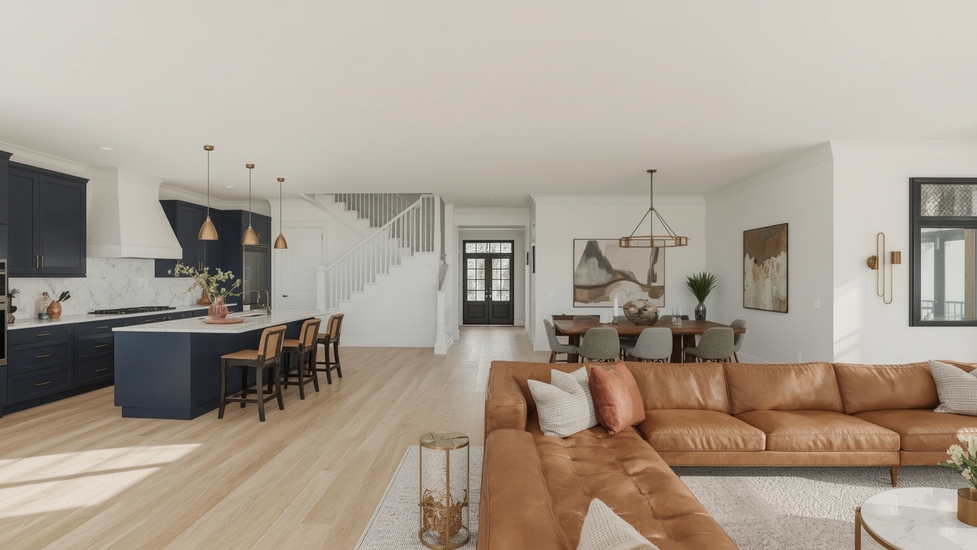
Imagine stepping into your stunning open-concept living space. Light floods in, rooms flow seamlessly, and there’s a palpable sense of grandeur. But what truly sets the mood, defines the zones, and elevates the entire experience? The Ultimate Guide to Choosing Interior Colours for Your Open Concept Luxury
Choosing the right interior colours for an open-plan luxury home isn’t just about picking pretty shades; it’s about orchestrating an experience. For discerning homeowners in the USA and UK, this decision impacts daily living, entertaining, and the overall value and feel of your most significant investment. The challenge? Creating harmony across vast, interconnected areas while ensuring each “Zone” feels intentional and sophisticated. Get it wrong, and even the most beautiful architecture can feel disjointed or overwhelming. Get it right, and you create a cohesive, inviting, and undeniably luxurious sanctuary. Interior colors used in open concept luxury homes
Drawing from years of experience analysing high-end design trends, collaborating with leading interior designers across London and New York, and studying the science of colour psychology and spatial perception, this guide cuts through the noise. We’ll translate complex design principles into actionable advice, backed by insights from revered paint authorities like Farrow & Ball, Benjamin Moore, and Sherwin-Williams, alongside timeless design philosophies. Let’s unlock the palette for your perfect open-concept masterpiece.
10 Expert-Approved Colour Strategies for Open Concept Luxury Homes
Here’s our curated list of the most effective and elegant colour approaches, designed specifically for sophisticated open-plan living:
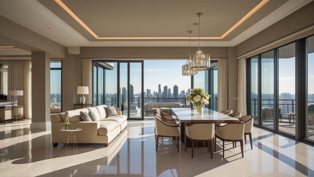
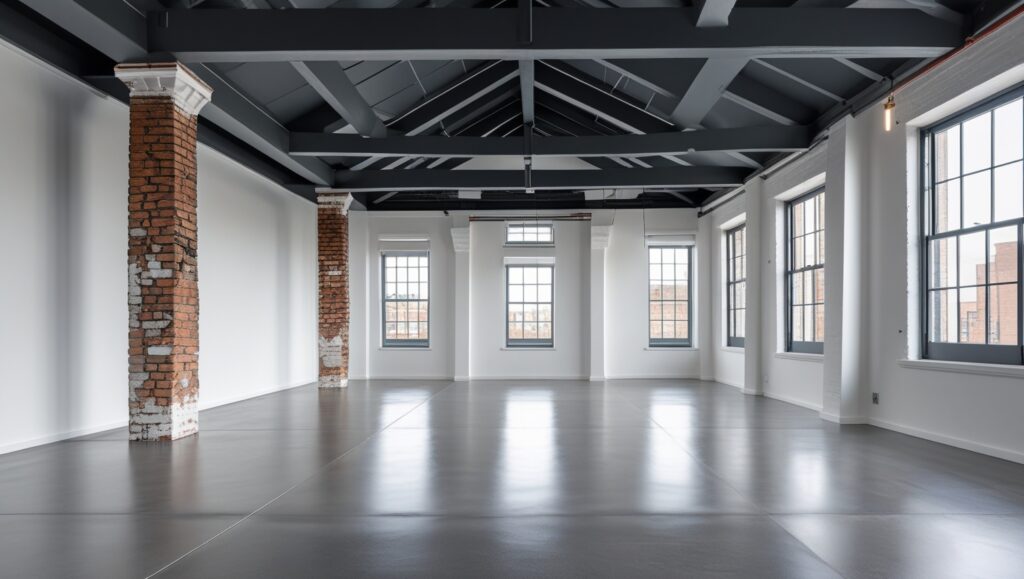
The Power of a Unified Base
- Strategy: Paint the majority of your open space (walls, ceilings, often trim) in one sophisticated, light-to-mid-tone neutral. This creates an expansive, serene backdrop.
- Why it Works: Eliminates visual choppiness, makes the space feel larger and brighter, and allows architectural details and furnishings to shine. Luxury favours subtlety and cohesion.
- Actionable Tip: Go beyond basic white. Choose complex neutrals with depth: warm greiges (like Farrow & Ball’s `Pointing` or Benjamin Moore’s `Edgecomb Gray`), soft taupes (Sherwin-Williams `Aesthetic White`), or pale, warm greys (Farrow & Ball `Cornforth White`). Ensure undertones (warm, cool, neutral) complement your fixed elements (flooring, stonework).
- Expert Backing: Leading designers consistently advocate for a cohesive base in open plans. Studies on spatial perception confirm light, unified backgrounds enhance the feeling of space.
The Power of a Unified Base
Read More:- Inside the Bold Beauty of Navy Blue Interiors: Luxe Design Tips You’ll Love
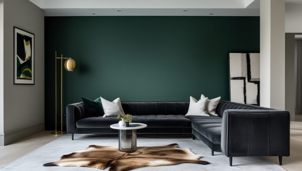
Define Zones with Sophisticated Accent Walls
- Strategy: Use deeper, richer colours on key walls to subtly define functional areas (e.g., behind the sofa in the living zone, the headboard wall in a bedroom alcove, or the feature wall in the dining area).
- Why it Works: Adds visual interest and intimacy to specific zones without physical barriers, creating a sense of purpose within the open flow.
- Actionable Tip: Choose colours that harmonise beautifully with your base neutral. Think deep blues (Farrow & Ball ‘Hague Blue’) forest greens (Benjamin Moore ‘Hunter Green’), or rich terracottas (Sherwin-Williams `Cavern Clay`). Ensure the accent wall has strong architectural presence.
- Expert Backing: Interior design principles emphasise using colour and texture to define space without walls. Colour psychology shows deeper hues can create a sense of cosiness and focus.
Define Zones with Sophisticated Accent Walls
Embrace Monochromatic Elegance
- Strategy: Use varying tones, tints, and shades of a single sophisticated colour family throughout the open space.
- Why it Works: Creates an incredibly cohesive, calm, and visually elongating effect. It’s inherently luxurious and allows for subtle textural play.
- Actionable Tip: Start with a mid-tone base (e.g., a soft grey-blue). Use a lighter tint for ceilings, a deeper shade for cabinetry or an accent wall, and incorporate textures in similar tones (linen, velvet, stone). Perfect for minimalist or serene luxury aesthetics.
- Expert Backing: High-end designers like Kelly Wearstler often utilise tonal variations for depth and drama. It simplifies decision-making while maximising impact.
Embrace Monochromatic Elegance
Read More:- Modern Living Room Design: Creating a Cozy and Stylish Space
Utilise Architectural Features as Colour Anchors
- Strategy: Highlight key architectural elements with distinct colour. Paint built-in shelving, window trim, archways, or ceiling beams in a contrasting or complementary hue.
- Why it Works: Draws the eye, emphasises beautiful craftsmanship, and adds layers of interest without overwhelming the space. It defines structure within openness.
- Actionable Tip: Use classic contrasts like crisp white trim against deeper walls, or try bolder moves like painting beams in a charcoal grey or deep green. Ensure the colour choice enhances, not fights, the architecture.
- Expert Backing: Traditional and contemporary luxury design both leverage architectural details. Painting features is a timeless technique for adding character and definition.
Utilise Architectural Features as Colour Anchors
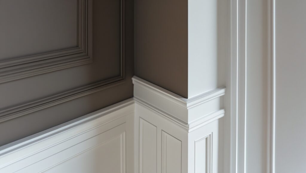
The “Two-Tone” Trim Triumph
- Strategy: Paint walls in your chosen neutral, but use a slightly different, complementary shade for all trim, doors, and potentially ceilings. Avoid stark white-on-white unless specifically desired.
- Why it Works: Adds subtle depth, dimension, and a bespoke feel. It frames the space elegantly and feels more curated than uniform white.
- Actionable Tip: Pair a warm wall (e.g., `Swiss Coffee’ by Benjamin Moore) with a cooler, crisp trim white (`Chantilly Lace’). Or use a darker trim for dramatic effect against light walls (e.g., `Railings` by Farrow & Ball with `Wevet’).
- Expert Backing: Paint authorities like Farrow & Ball are renowned for their complex white and neutral palettes designed to work harmoniously together, creating nuanced sophistication.
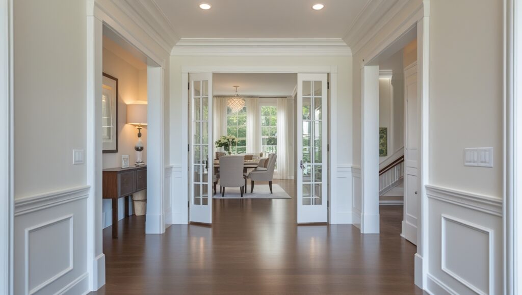
The “Two-Tone” Trim Triumph
Incorporate Earthy & Organic Palettes
- Strategy: Utilise colours inspired by nature – warm clays, soft moss greens, sandy beiges, stone greys, and ochres.
- Why it Works: Creates a grounded, serene, and timelessly luxurious atmosphere. Perfect for connecting indoor-outdoor living and complementing natural materials (wood, stone, linen).
- Actionable Tip: Layer different earthy tones across zones. Use a warm sandy beige (`Shiplap` by Sherwin-Williams) as a base, add olive green accents (`Sage Green` by Little Greene), and deep terracotta (`Red Earth` by Farrow & Ball) for warmth. Feels organic and welcoming.
- Expert Backing: Biophilic design principles, linking humans to nature, are a major trend in luxury homes. Earth tones are inherently calming and enduring.
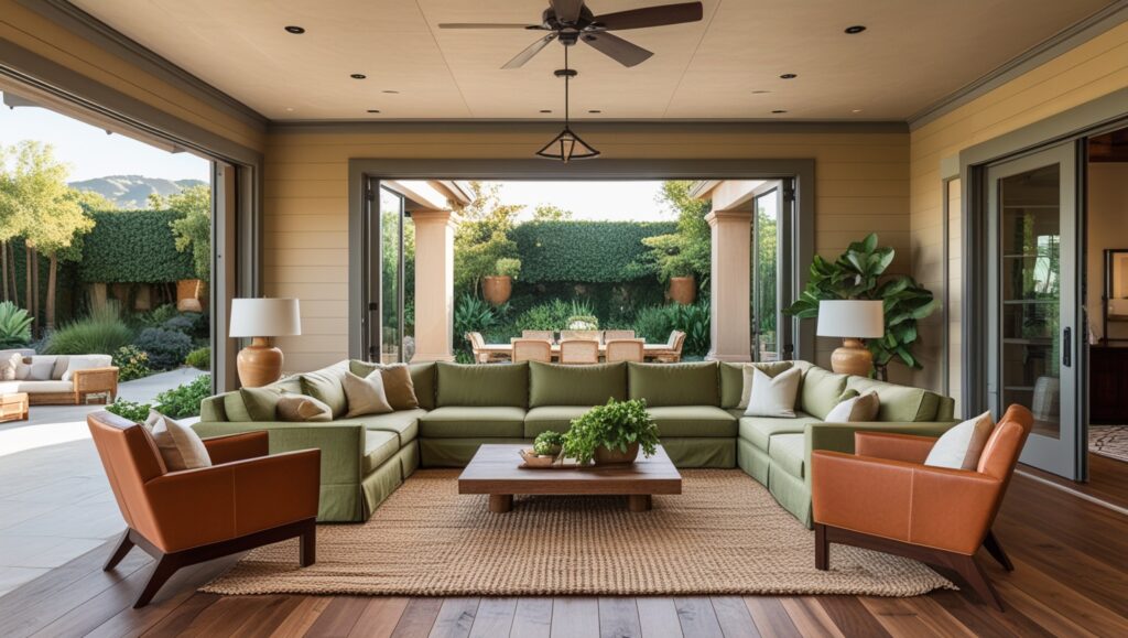
Incorporate Earthy & Organic Palettes
Read More:- 10 Bold and Brilliant Home Decor Tips Inspired by This Modern Panda-Themed Apartment
Don’t Underestimate the Ceiling (The Fifth Wall)
- Strategy: Move beyond white ceilings. Use colour overhead to add intimacy, drama, or heighten the sense of space.
- Why it Works: A coloured ceiling can visually lower a too-tall space for cosiness, unify an area, or create a stunning, unexpected focal point.
- Actionable Tip: For intimacy in a large living area: a soft, warm grey or blue-grey ceiling. For drama in a dining zone: a deep charcoal or jewel tone. To enhance height: a very pale tint of a wall colour.
- Expert Backing: Top designers increasingly treat the ceiling as a key design element. Using colour here is a hallmark of considered, bespoke interiors.
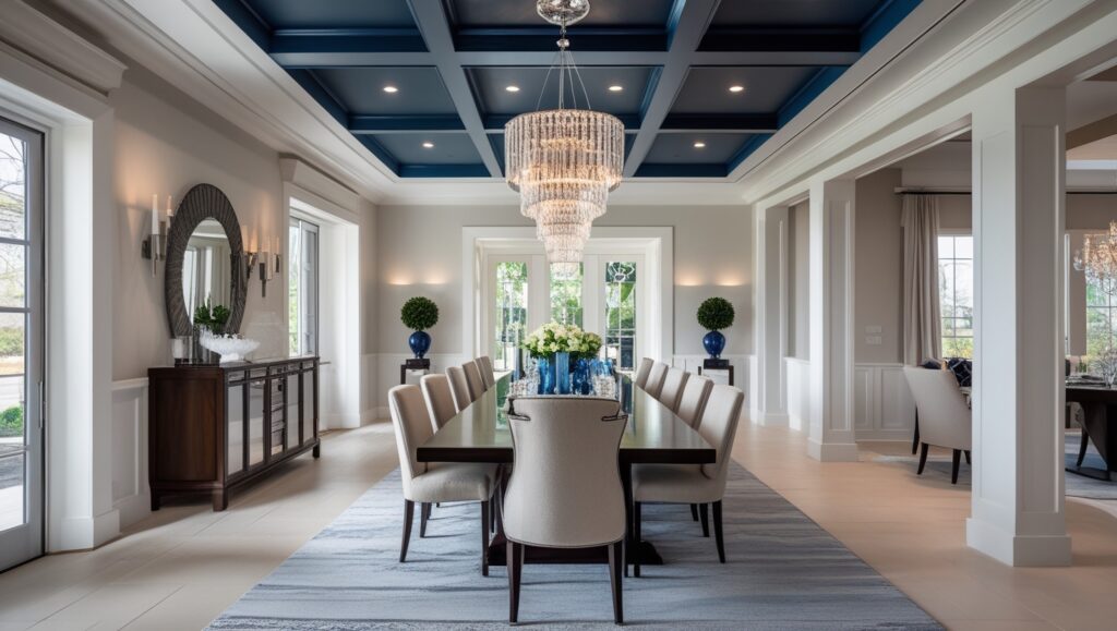
Don’t Underestimate the Ceiling
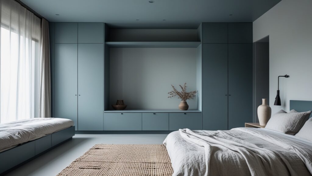
Leverage the Sophistication of Muted Pastels
- Strategy: Employ soft, greyed-down pastels like powder blue, blush pink, sage green, or lavender.
- Why it Works: Adds gentle colour and personality without overwhelming the openness. Creates a soft, elegant, and contemporary feel.
- Actionable Tip: Use these as accent colours on smaller walls, cabinetry (e.g., a powder room vanity or kitchen island), or within furnishings. Pair with rich neutrals for balance (e.g., `Setting Plaster` by Farrow & Ball with `Down Pipe`). Avoid overly sugary tones.
- Expert Backing: Muted pastels feature heavily in contemporary luxury palettes (think designer brands like De Gournay or Fermoie fabrics). They offer colour without sacrificing serenity.
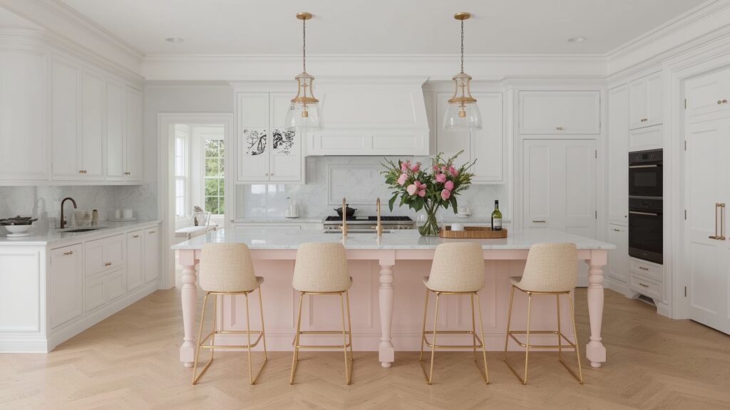
Leverage the Sophistication of Muted Pastels
Introduce Depth with Jewel Tones (Strategically)
- Strategy: Use rich, saturated colours like emerald green, sapphire blue, amethyst purple, or ruby red as bold accents in specific zones or on significant features.
- Why it Works: Adds instant glamour, drama, and a sense of opulence. Creates powerful focal points.
- Actionable Tip: Best used on a single statement wall, inside built-in cabinetry, on a kitchen island, or in a cosy library nook within the open plan. Balance with plenty of neutral space and luxurious textures (brass, velvet, marble). Example: Benjamin Moore’s `Newburg Green` on a study wall.
- Expert Backing: Jewel tones are classic luxury colours. Used strategically, they evoke richness and confidence without dominating an open space.
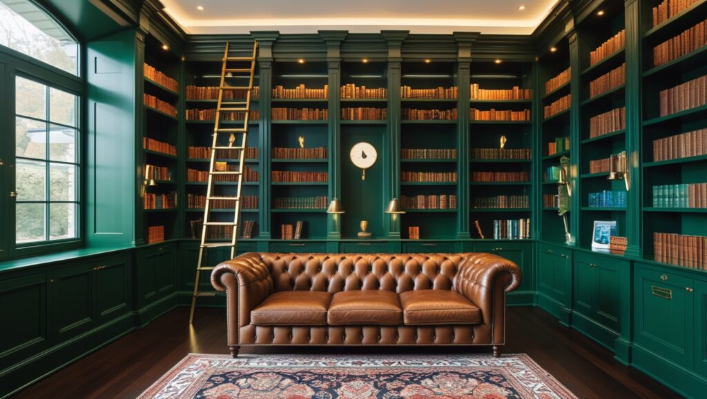
Introduce Depth with Jewel Tones
Prioritise Paint Quality & Finish
- Strategy: Invest in premium paint from trusted luxury brands. Choose the right finish for each surface (e.g., Eggshell for walls, Satin for trim, Matte for ceilings).
- Why it Works: High-quality paint offers superior coverage, richer pigment, better durability, and a more luxurious sheen. The correct finish enhances the look and protects surfaces.
- Actionable Tip: Opt for brands renowned for depth of colour and quality like Farrow & Ball, Little Greene, Benjamin Moore (Regal/Aura lines), Sherwin-Williams (Emerald/Cashmere lines). Use matte or estate emulsion for walls (hides imperfections), eggshell/satin for woodwork (wipeable), and full gloss sparingly for high-impact details.
- Expert Backing: The finish dramatically impacts light reflection and perceived colour. Luxury designers specify premium paints for their performance and aesthetic results.
Prioritise Paint Quality & Finish
Conclusion: Your Cohesive Colour Masterpiece Awaits
Transforming your open-concept luxury home with colour is an exciting journey. Remember, the goal isn’t just decoration; it’s about crafting an atmosphere that reflects your style, enhances the architecture, and makes daily living a pleasure. By embracing strategies like a unified neutral base, strategic accent walls, tonal palettes, and highlighting architectural features, you can achieve both breathtaking flow and intimate definition.
Prioritise quality paint, test colours relentlessly in your unique light, and don’t be afraid to introduce depth or personality through well-considered accents. Whether you crave serene earthiness, elegant monochrome, or a touch of jewel-toned drama, the perfect palette for your open sanctuary is within reach.
FAQs
What are the best neutral colours for a luxury open plan?
Move beyond pure white. Look for complex neutrals with depth and subtle undertones: warm greiges (beige-grey), soft taupes (grey-brown), pale warm greys, or creamy off-whites. Brands like Farrow & Ball (`Pointing`, `Cornforth White`, `Dimity`), Benjamin Moore (`Edgecomb Gray`, `Balboa Mist`, `White Dove`), and Sherwin-Williams (`Agreeable Gray`, `Alabaster`, `Aesthetic White`) excel at these.
Are dark colours a bad idea for open floor plans?
Absolutely not! Dark colours can be incredibly luxurious and effective when used strategically. They work best on accent walls, within built-ins, on cabinetry (like a kitchen island), or in defined alcoves within the open space. They add drama, depth, and intimacy. Ensure the surrounding areas have ample light and lighter tones to balance.
How important is paint finish in an open-concept home?
Extremely important! Finish affects durability, light reflection, and the overall feel. Matte or Estate Emulsion finishes are popular for walls as they minimise imperfections and offer a luxurious, velvety look. Satin or Eggshell finishes are better for trim, doors, and high-touch areas as they are more wipeable and have a subtle sheen. Gloss can be used sparingly for dramatic effect on features.
What are the luxury colors for houses?
Luxury colors for houses typically include elegant and timeless shades such as warm greige, soft white, charcoal gray, navy blue, sage green, taupe, dusty rose, and pale gold. These colors create a sophisticated ambiance, enhance natural light, and pair well with high-end finishes like marble, brass, and natural wood accents, making spaces feel refined.
What color to paint an open concept?
For an open concept space, choose cohesive, neutral colors like warm greige, soft white, or light taupe to create flow and brightness. Add subtle accents like navy, sage green, or charcoal to define areas without disrupting harmony. Consistent undertones and natural light-friendly shades ensure a seamless, sophisticated look throughout.
1 thought on “The Ultimate Guide to Choosing Interior Colours for Your Open Concept Luxury”